4 hours
Discovery
Brand Audit
Audience Context
Visual References
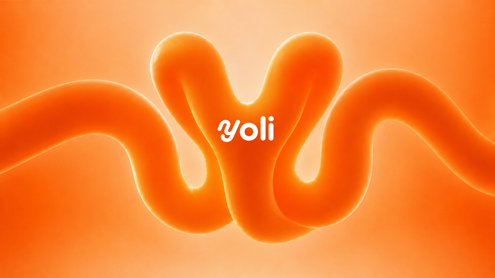
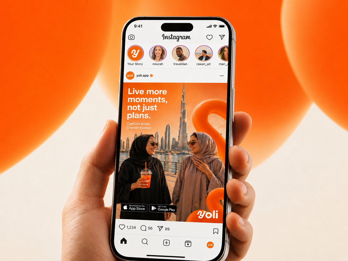
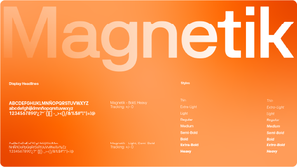
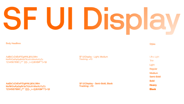
YOLI is a fresh, expressive smoothie and wellness identity built around bright fruit colors, soft curves, friendly typography, and a visual system made to feel natural, energetic, and instantly approachable.
Discovery
Strategy
Solution
Early visual explorations, posters, product applications, and brand touchpoints.
The challenge was making YOLI feel playful and fresh without becoming visually noisy. The logo, colors, and product scenes needed to communicate fruit, wellness, and friendliness while staying clean enough for packaging, posters, storefronts, and digital placements.

The final identity gives YOLI a memorable presence from the first glance. Bright green and fruit-inspired accents, rounded typography, and consistent mockups create a flexible brand system that feels joyful, healthy, and easy to recognize.
Explore the YOLI brand applications, posters, logo system, storefront visuals, and digital mockups.